Responsive Web Design That Commands Universal Device Domination

Ready to stop losing mobile visitors to poor experiences? Generic responsive designs kill cross-device conversion potential. Our strategic responsive web design approach transforms device-specific websites into universally optimized powerhouses that users love on every screen and competitors desperately try to replicate.

Transform Your Multi-Device Presence. Dominate Every Screen

Responsive web design isn’t optional—it’s the difference between thriving and failing in the multi-device digital era. With 58% of global web traffic from mobile devices and 61% of users unlikely to return to poorly mobile-optimized sites, non-responsive websites kill business growth. Our battle-tested responsive design strategies position your brand as the obvious choice across all devices.

Our Responsive Web Design Services

We build dominant responsive websites that crush device-specific competition. Define your universal presence, forge distinctive multi-device experiences, and magnetize customers across every screen. Stop losing mobile visitors: start converting them universally.

Strategic Multi-Device Planning & Architecture

We help define your meaningful cross-platform digital mission that inspires users across all devices, creating authentic responsive connections that drive lasting engagement beyond single-device interactions through comprehensive multi-screen strategy development.

Mobile-First UX Design

Together we establish genuine device-agnostic design principles that reflect your brand values, differentiate your business, and forge deeper relationships with your ideal customers through intuitive navigation optimized for every screen size and interaction method.

Adaptive Visual Design Systems

Through detailed device usage research, we identify your perfect multi-device audience, enabling focused responsive strategies that connect meaningfully and generate maximum business impact across smartphones, tablets, desktops, and emerging devices.

Comprehensive Device Performance Audit

Our comprehensive responsive audit reveals cross-device usability barriers, performance bottlenecks, and strategic design advantages to elevate your website above industry competitors effectively through data-driven multi-device optimization and improvement identification.

Cross-Platform Development Excellence

We create powerful responsive websites that communicate your unique value proposition consistently, differentiate your offerings across all devices, and resonate strongly with users regardless of their preferred screen size or interaction method.

Flexible Content Management Systems

Develop your authentic responsive personality through consistent design language across all device breakpoints, building recognition, trust, and meaningful connections with your audience through cohesive cross-platform brand experiences.

Performance & Speed Optimization

Design efficient responsive systems including lightning-fast loading speeds across devices, smooth touch interactions, and optimized user flows that create instant engagement and communicate your brand’s excellence through superior multi-device performance.

Touch-Optimized Interface Design

Craft compelling responsive interfaces that emotionally connect with users regardless of input method, showcase your authentic brand story consistently, and build lasting loyalty through meaningful cross-device interaction design.

Progressive Enhancement Strategy

Establish comprehensive responsive protocols ensuring unified website performance across all browsers, devices, and screen sizes, strengthening user experience and building unwavering trust through consistent multi-platform functionality.

Our Responsive Web Design Process That Drives Universal Engagement

The process of responsive web design and development follows a strategic chronological order designed for maximum cross-device impact and universal user satisfaction.

How Our Responsive Web Design Strategy Helps Your Business

Gaining Universal Digital Advantage

Strategic responsive web design defines your unique multi-device differentiation, clearly showing users why they should choose your consistently optimized business over competitor alternatives across smartphones, tablets, and desktops through superior cross-platform experience.

Trust Building Through Consistent Experience

Strong responsive design strategy builds lasting user trust by consistently delivering optimized experiences across all devices, creating reliable digital relationships that form your business’s foundational customer base through credible, device-agnostic design.

Enhanced Cross-Device Conversion

Professional responsive websites naturally attract and convert visitors regardless of device preference, generating valuable leads that transform into loyal customers through authentic, trusted multi-platform experience design and strategic universal optimization.

Improved Mobile User Retention

Exceptional responsive experiences create smooth user journeys across devices that encourage exploration and return visits, building higher engagement rates that sustain business growth through optimized cross-platform flows and reduced mobile bounce rates.

SEO & Search Visibility Enhancement

Google-favored responsive websites command premium search positioning by demonstrating superior mobile optimization and user experience quality, reducing acquisition costs through improved search rankings and perceived universal value.

Unified Multi-Platform Brand Experience

Clear responsive design systems unite all device touchpoints around shared customer-centered values, boosting brand recognition and fostering customer loyalty that drives business success through consistent optimized experiences.

Future-Proof Digital Innovation

Well-designed responsive websites inspire creative adaptation and innovative features that align perfectly with emerging device trends and user behavior evolution through cutting-edge adaptive technologies.

Business Growth Acceleration

Strong responsive design attracts and retains users across all devices while boosting universal conversions, helping businesses distinguish themselves in competitive multi-device marketplaces for sustained growth and market leadership.

Digital Investment Protection

Professional responsive websites significantly increase ROI by serving all device users effectively, attracting broader audiences and maximizing business potential through comprehensive device coverage and future-ready design architecture.

Our Comprehensive Responsive Web Design Process

Why Choose Times IT Sylhet for Your Responsive Web Design?

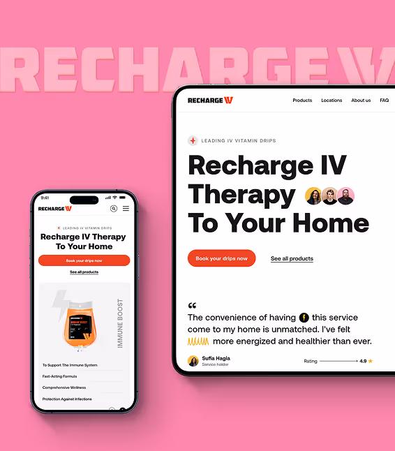
Times IT Sylhet combines expertise with innovation to create exceptional responsive websites that drive universal engagement and build lasting customer relationships effectively through strategic multi-device design excellence.

Proven Multi-Device Success

200+ global responsive websites trust us with their universal optimization success

Complete Device Coverage

From mobile-first to desktop excellence across all screen sizes

Cutting-edge Responsive Innovation

Keep you ahead of device trends and adaptive technologies

Strategic Responsive Specialists

Who understand device behavior, not just flexible layouts

Flawless Cross-Platform Execution

Turn responsive vision into seamless multi-device reality

Our Responsive Web Design Success Stories

Our expertise converts single-device websites into universally optimized digital experiences. See how our strategic responsive web design drives cross-device engagement, fosters universal accessibility, and creates optimization stories that redefine multi-platform industry standards.

"Times IT Sylhet transformed our digital presence with incredible attention to detail and creativity. Their comprehensive approach to website design and development made our project an absolute success."

Ashikul Islam

Co Founder, Times IT Sylhet

78%

Boosted 78% mobile conversion rates for responsive clients like you

92%

Achieved 92% improvement in mobile user engagement

6X

Helped clients achieve 6X higher cross-device lead generation through superior responsive design

Client Testimonial

Results-driven responsive excellence: hear directly from our satisfied multi-device clients.

“Times IT Sylhet transformed our corporate website with incredible attention to detail and creativity. Their commitment to quality made our digital project an absolute success.”

Ashikul Islam

Co Founder, Times IT Sylhet

“They perfectly realized my concept while maximizing efficiency. Their blend of professionalism, innovation, and technical excellence truly exceeded expectations.”

Johnny Lim C.K

Cycle & Carriage, Singapore

“Within just two weeks, Times IT Sylhet delivered outstanding content that surpassed our expectations, demonstrating excellent project management and consistently positive communication.”

Yaqin Liu

Product Manager at Lingxing

Frequently Asked Questions

Find the right solution
for you now

Do You Offer Customized Responsive Web Design Services?
Yes, we offer completely customized responsive web design services based on your specific device requirements, user behavior patterns, target audience preferences, and strategic multi-platform business objectives.
To find the right responsive web design agency, focus on understanding their multi-device expertise, responsive design process, and cross-platform portfolio fit. Look beyond prices and consider the team’s experience, mobile optimization portfolio, and device-focused approach. Ensure they align with your universal vision and are responsive to your needs by organizing a meeting or video call before making a decision.
A responsive web design audit is the process of evaluating your website’s performance and user experience across multiple devices to identify optimization opportunities, usability issues, and areas for cross-platform improvement. It involves analyzing mobile performance, tablet functionality, desktop experience, and responsive breakpoint effectiveness.
Responsive web design service benefits your business by providing optimal user experiences across all devices, improving mobile conversion rates, enhancing search engine rankings, increasing audience reach, and ultimately driving business growth through strategic universal accessibility.
Responsive design covers all devices including smartphones (iOS/Android), tablets (various sizes), desktop computers, laptops, smart TVs, and emerging devices, ensuring optimal user experience regardless of screen size, resolution, or orientation.
The cost of responsive web design varies based on your specific complexity requirements, device optimization scope, and project scale. We offer tailored solutions that ensure comprehensive multi-device strategy at competitive pricing with transparent cost structures.
Responsive design adapts seamlessly across all devices with one flexible codebase, while mobile-only design creates separate experiences for specific devices. Responsive design is more cost-effective, SEO-friendly, and future-proof than maintaining multiple device-specific versions.
Professional responsive design actually improves loading speed through optimized code, adaptive image loading, and device-specific performance optimization. We implement efficient techniques that enhance speed across all devices while maintaining visual quality.
During redesign, your current website remains live and functional. We work on a staging environment and plan seamless transition to minimize downtime and ensure continuous business operations throughout the transformation process.
We conduct comprehensive testing using real devices, browser developer tools, responsive testing platforms, and automated testing tools to ensure optimal performance across various screen sizes, orientations, and device capabilities.
Yes, we provide comprehensive post-launch support including cross-device performance monitoring, responsive optimization updates, new device compatibility testing, and continuous improvement recommendations to ensure sustained multi-platform success.
Absolutely! We specialize in converting non-responsive websites into fully adaptive experiences through comprehensive responsive retrofitting, strategic restructuring, and performance optimization while preserving your content and SEO value.
Responsive design deliverables typically include device audit findings, responsive strategy documentation, adaptive wireframes, multi-device visual mockups, breakpoint specifications, performance optimization guidelines, and ongoing cross-platform maintenance recommendations.
Mobile-first approach prioritizes smartphone experience then scales up to larger screens, while desktop-first starts with large screens and scales down. We recommend mobile-first for better performance and user experience alignment with current web usage patterns.
Responsive breakpoints are specific screen width points where your website layout adapts to provide optimal viewing experience. We strategically define custom breakpoints based on your content, user behavior, and device usage analytics for maximum effectiveness.

CONTACT WITH US

Let's begin your responsive transformation today

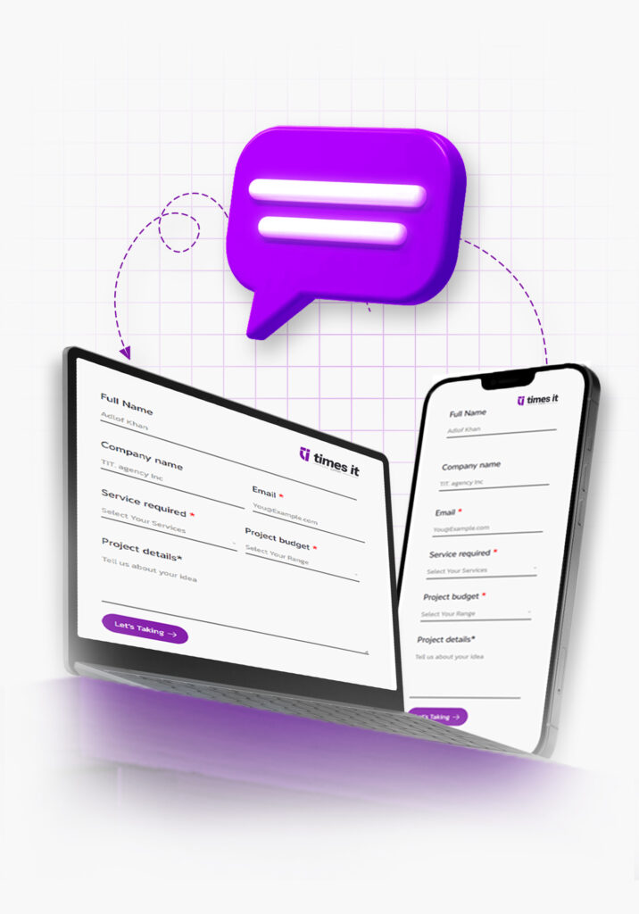
We’ll arrange a discovery call to explore your multi-device vision, conduct a comprehensive cross-platform audit, create a tailored responsive proposal, and begin crafting your universally optimized website upon approval.