Abdul Motaleb High School, formerly known as A.M. High School faced a mandatory name change following new government regulations. This update triggered the need for a refined visual identity—one that not only aligned with the new name but also represented the true spirit, heritage, and academic values of the institution.
The previous logo communicated the school as a seeker of knowledge. While meaningful, it unintentionally placed the institution in a passive role. The school required a confident identity that communicates leadership, protection, and educational excellence without losing its cultural and academic roots.
After several discussions, the project goals were clearly set:
– Craft a new institutional slogan that reflects the school’s values.
– Develop a new logo or institutional emblem aligned with the updated school name that becomes a confident, authoritative face of the institution.
– Preserve cultural relevance while modernizing for digital and print use.
– Improve readability at small sizes and on large signage.
– Deliver a comprehensive identity package and mockups for implementation.
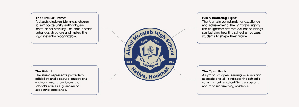
At this stage, I shifted the design direction toward creating a timeless emblem that would carry the school’s mission, personality, and long-term vision.
The project began with:
– A full review of the school’s history, academic culture, and communication style
– Benchmarking against traditional Bangladeshi school emblems and modern education marks.
– Rough sketches exploring symbolism, structure, and hierarchy
– Brainstorming sessions around values like excellence, openness, security, and enlightenment
Through countless iterations, the conceptual foundation of the new emblem began to take shape.
The redesigned emblem positions the institution as a source of knowledge, a protector of education, and a guide for students’ growth.
The Circular Frame:
A classic circle emblem was chosen to symbolize unity, authority, and institutional stability. The solid border enhances structure and makes the logo instantly recognizable.
The Shield:
The shield represents protection, reliability, and a secure educational environment. It reinforces the school’s role as a guardian of academic excellence.
The Open Book:
A symbol of open learning — education accessible to all. It reflects the school’s commitment to scientific, transparent, and modern teaching methods.
Pen & Radiating Light:
The fountain pen stands for excellence and achievement. The light rays signify the enlightenment that education brings, symbolizing how the school empowers students to shape their future.
The new emblem successfully shifts the school’s visual identity:
Before:
The institution appears as an entity trying to gain knowledge.
After:
The institution stands strong as a provider, protector, and source of knowledge.
The contrast is immediate — the new design communicates confidence, discipline, and leadership
Color palette
Primary Navy: #0B2340 (authority, legibility)
Accent Beige: #F5EDE3 (warmth, heritage)
Gold Accent: #C49A4A (ceremony/achievement)
Neutral Gray: #6E7580 (supporting text)
Typography
Headline: Merriweather / Playfair Display (serif — scholarly tone)
Body: Inter / Roboto (clear digital readability)
The final logo brings:
A unified and authoritative identity that honors legacy and supports modern communication. Unique and distinguishable identity aligned with the school’s updated name A modern yet traditional emblem with long-lasting cultural relevance Readability and hierarchy optimized for signage, uniforms, documents, and digital channels. The new mark positions the school as both protector and provider of knowledge — clearer, more confident brand messaging.
The result is a visual identity that honors the school’s legacy while supporting its vision for the future.
Crafting unique visual identities
that capture your brand’s essence and resonate with your target audience.
© Copyright 2025 TimesIT - All Rights Reserved.