A Times IT Sylhet Branding & Digital Transformation Story
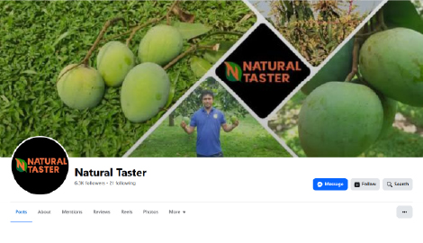
When SotejBD first came to us, it wasn’t called SotejBD at all.
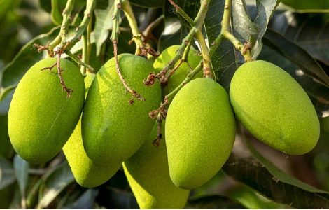
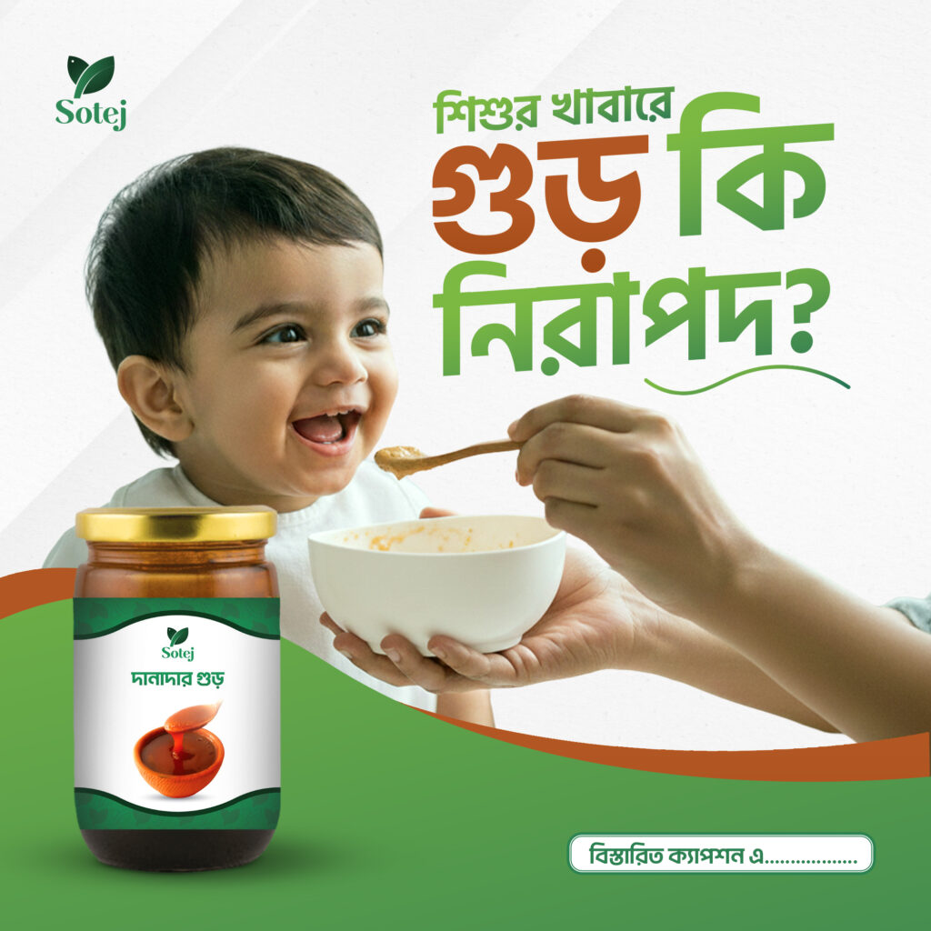
It was a small, passionate business selling natural items—honey, date molasses, Ilish, mangoes—foods that speak of home, purity, and tradition. The quality was there. The sincerity was there. What wasn’t there was a brand strong enough to carry that vision forward.
The founders knew they wanted to expand across Bangladesh, with physical outlets and a strong digital presence. They already had the products. Now they needed an identity that lived up to the freshness and honesty behind them.
That’s when they reached out to Times IT Sylhet.
We didn’t treat it as just another branding project.
We saw it as shaping a story.
Because a brand that deals with purity deserves a presence that feels pure.
Our first conversations were eye-opening.
The business, then known as “Natural Taster,” didn’t reflect the heart of the company. It sounded generic, almost forgettable—far from the quality and authenticity their products carried.
What the brand needed was clarity.
– A name that Bangladeshis could feel.
– A presence people could trust instantly.
– A visual identity that could grow with them.
The client proposed a name they had been thinking about—SotejBD.
“Sotej” means fresh, and immediately we knew we had something special to work with.
From that moment on, our mission became clear:
Present SotejBD as a brand people can rely on, connect with, and proudly choose for their families.
Before touching a single design element, we immersed ourselves in the brand’s universe.
– We studied how Bangladeshi families choose natural foods.
– We analyzed what people expect when they see the word “fresh.”
– We explored how major organic brands communicate, what they get right, and where they fall short.
We tasted the brand—literally and visually.
Only then did we begin crafting the soul of SotejBD.
What emerged from this phase was a simple, honest conclusion:
This brand should feel like nature walking into your home—clean, warm, and trustworthy.
Every great identity needs a backbone—its personality, its tone, its purpose.
For SotejBD, we shaped a strategy built around three pillars:
Freshness. Purity. Trust.
– We wanted the visuals to feel alive but calm.
– We wanted the messaging to feel simple but meaningful.
And most importantly, we wanted every touchpoint—logo, website, social media, packaging—to speak the same language.
A language that says,
“You can trust what you’re bringing into your home.”
The challenge was to create a symbol that expressed the diversity of SotejBD’s products without feeling cluttered. Honey. Molasses. Fruits. Fish. Everything tied to nature.
So, we built a symbol that combines two universal elements:
A leaf
A fish
Two shapes, blended into one smooth, gentle form.
Not forced. Not complicated. Just naturally connected—like their products.
– The leaf represents freshness and growth.
– The fish represents purity and tradition.
Together, they create a mark that is calm, organic, and instantly recognizable.
We used soft curves to keep the symbol friendly.
We built it with balanced geometry so it carries a sense of professionalism.
This is not just a logo.
It’s a story of where the brand comes from and where it’s going.
We chose a harmonious duo of greens—one light, one deep.
The lighter green brings in purity.
The darker green brings stability and trust.
They blend like a leaf catching both morning light and shade.
It’s a palette that feels fresh without trying too hard.
It makes the viewer feel safe.
On social media, we focused on storytelling.
Not just showing products—but showing what they mean.
Why honey matters.
Why pure molasses feels different.
Why Ilish deserves respect.
We shaped posts that feel calm and modern, using both Bangla and English to ensure connection and clarity.
For packaging, we kept everything light, clean, and recognizable, using consistent color balance, clear product naming, and gentle curves.
The packaging didn’t just carry the product—
It carried the brand’s promise.
By the time the project was complete, SotejBD had a completely new identity built from the ground up:
Everything connected.
Everything is consistent.
Everything rooted in the truth of who they are.
The transformation was immediate.
The brand now looked and felt premium—without losing its warmth.
The new identity gave them the confidence to scale.
Their digital presence started building real trust.
And perhaps most importantly, customers began seeing them the way they always hoped to be seen.
SotejBD now stands ready to expand across the country—with a brand identity strong enough to lead the way.
For us at Times IT Sylhet, this wasn’t just another project. It was a partnership. A chance to help a sincere business tell its story with clarity and beauty.
And that’s the kind of work we love doing.
Crafting unique visual identities
that capture your brand’s essence and resonate with your target audience.
© Copyright 2025 TimesIT - All Rights Reserved.