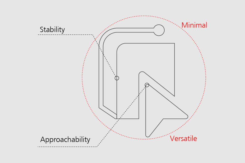
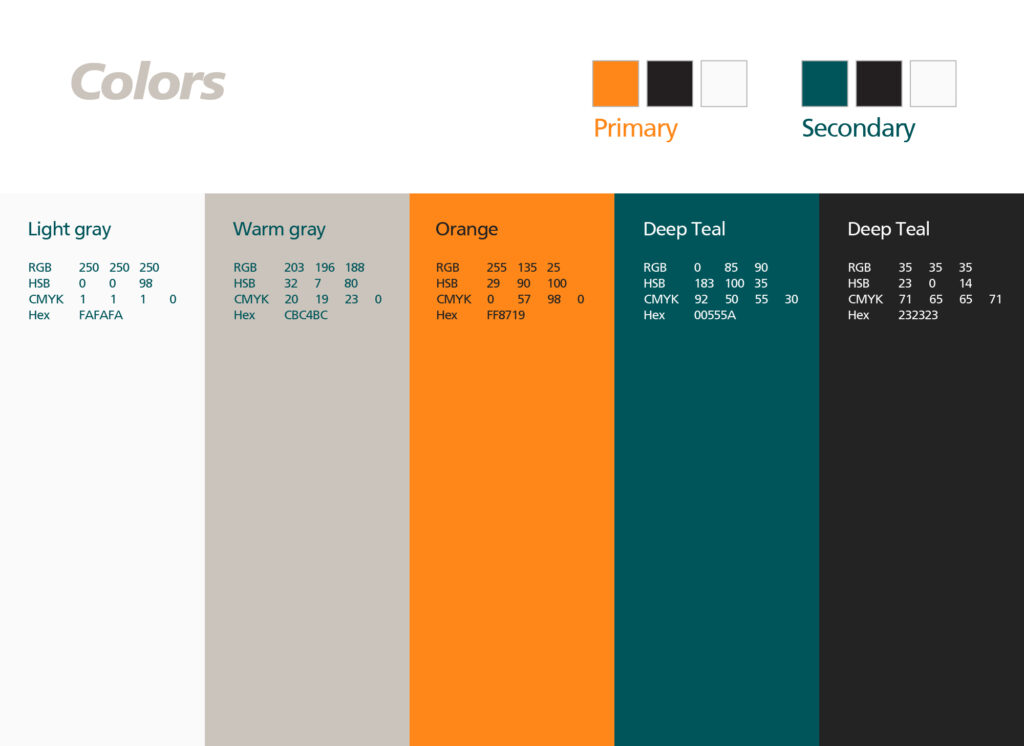
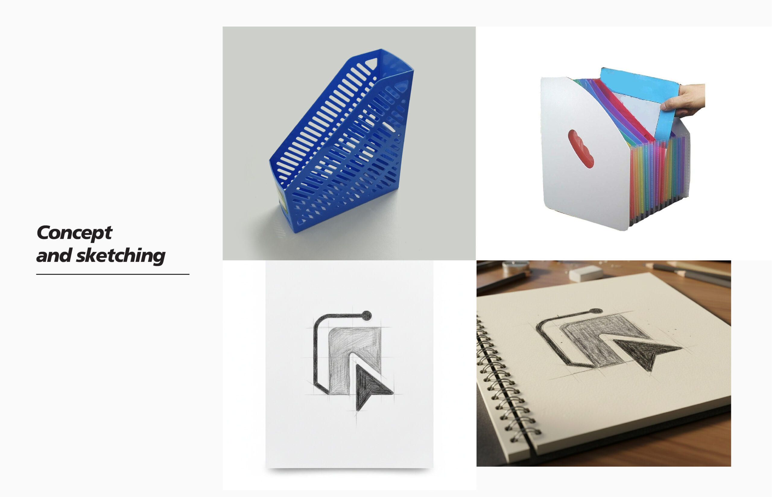
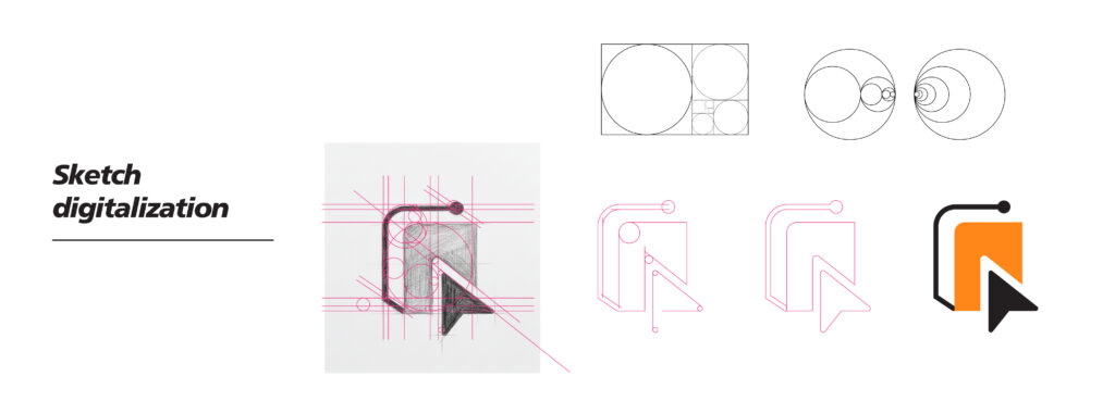
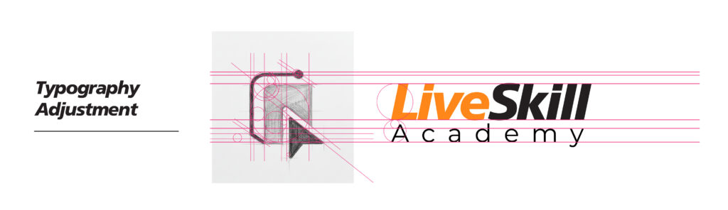
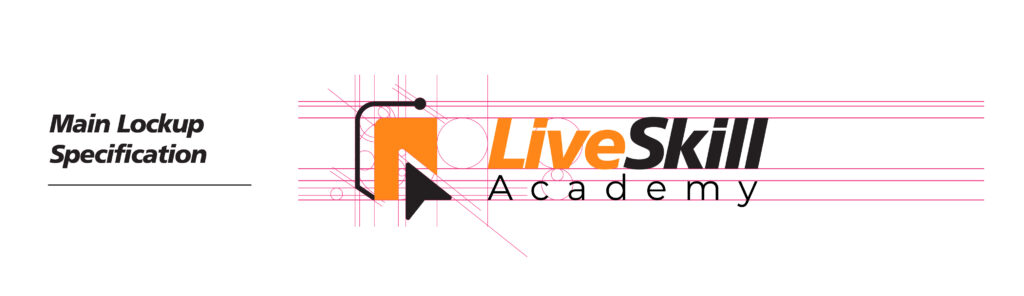
Live Skill Academy approached us as a newly established online learning platform preparing to launch nationally, with ambitions to expand globally. Their goal was clear but broad: to build a modern and trusted brand that resonates with anyone seeking professional skill development.
They had no prior branding direction, no existing identity, and no preferences regarding color, typography, or style. Our role was to conceptualize, design, and build the entire brand ecosystem from scratch.
This included:
– Full visual identity (logo, symbol, color palette, typography)
– Brand story and positioning
– Social media presence & templates
– Custom website (UI/UX + development-ready design)
– Comprehensive creative assets for launch
Live Skill Academy gave us complete creative freedom, fully trusting our expertise in branding
and digital design to develop the right direction for their long-term vision.
Live Skill Academy is an online learning platform offering a diverse range of courses across industries, covering general education, technical skills, professional development, and more.They had no prior branding direction, no existing identity, and no preferences regarding color, typography, or style. Our role was to conceptualize, design, and build the entire brand ecosystem from scratch.
This platform will serve:
– Students
– Young professionals
– Career switchers
– Adults pursuing professional certifications
– Individuals seeking market-ready skills
Therefore, the brand required:
– A simple yet memorable identity
– A modern, scalable, globally adaptable symbol
– A visual style that feels trustworthy, educational, and innovative
– A color system that is both professional and emotionally engaging
The final Live Skill Academy logo may appear simple, but it is the result of extensive exploration.
During a 15-day design period, we tested:
– Pure typographic directions
– Geometric and abstract icons
– Conceptual metaphors (growth, steps, learning paths, progress bars, books, doors, etc.)
– Multiple symbol structures and negative-space ideas
Ironically, the breakthrough came from an everyday object. While ideating, I noticed a file folder
lying on the table. A folder is universally symbolic of:
– Knowledge
– Organized learning
– Documents, resources, materials
– Professional growth
– Structure and academic reliability
This metaphor aligned perfectly with the essence of Live Skill Academy. I digitally simplified the
shape, refined its geometry, adjusted the angles, and introduced an additional element to
represent progress and forward movement within learning.
This evolved into the final icon.
The logo symbol is a modernized representation of a file folder, constructed with clean,
geometric precision. The design uses:
– Straight edges for stability
– Rounded corners for approachability
– Minimal lines to ensure versatility across digital and print formats
The top tab of the “folder” subtly hints at:
– Hierarchy and organization
– A learning repository
– A space where knowledge is stored and accessed
This creates a subconscious connection to education without presenting a literal book or graduation cap, thereby keeping the brand modern and timeless.
The symbol is:
– Easily recognizable at micro sizes (favicons, app icons)
– Distinctive even in monochrome
– Unique in shape, avoiding clichés common in education branding
This makes the logo:
– Future-proof
– Scalable
– Instantly memorable
The Orange Block = Learning Module / Lesson Page
– The orange shape resembles: a document, a lesson card, or a digital module.
– This suggests structured learning, course content, and organized knowledge.
The Cursor Pointer = Taking Action / Live Practice
– The pointer represents: clicking, selecting, taking action, interacting with content, learning by doing.
– It reinforces the “Live Skill” idea: practical learning, immediate execution, and active participation
The Circuit Node = Technology + Digital Skill
– The single black circuit line with a node at its tip symbolizes: technology, automation, digital interfaces, modern tools, AI symbolism
– It connects the learning (document) with the cursor (action), hinting that the entire process is tech-empowered.
When the elements combine, the symbol communicates:
“A place where digital tools, practical action, and structured learning come together to build real skills.”
For the Lifve Skill Academy brand, the typography needed to feel like a natural extension of the logo. We selected AG Foreigner because it mirrors the clean, modern character of the icon while maintaining strong readability across digital platforms.
AG Foreigner’s geometric structure aligns smoothly with the rounded shapes of the logomark, creating a balanced and cohesive visual identity. It looks professional without feeling stiff, and approachable without feeling casual—exactly the tone the brand requires.
The logo performs exceptionally well in:
– Full color
– Black-and-white
– Inverted layouts
– Website UI
– Social media icons
– Video intros
– Print formats
The palette for this logo focuses on a clean mix of orange, charcoal, and white, chosen to give the brand a modern and practical feel
The orange brings energy and a sense of forward movement—something that connects well with learning, action, and skill development. It makes the logo feel active without being too loud.
The charcoal balances that energy with a more grounded, professional tone. It keeps the identity clear, confident, and easy to trust, especially in digital environments.
Using white as the base allows the palette to breathe. It keeps the layout clean and gives the symbol and typography enough contrast to stand out in both small and large formats.
Overall, the combination is simple, modern, and flexible—strong enough for a logo, but adaptable across the rest of the brand.
Crafting unique visual identities
that capture your brand’s essence and resonate with your target audience.
© Copyright 2025 TimesIT - All Rights Reserved.