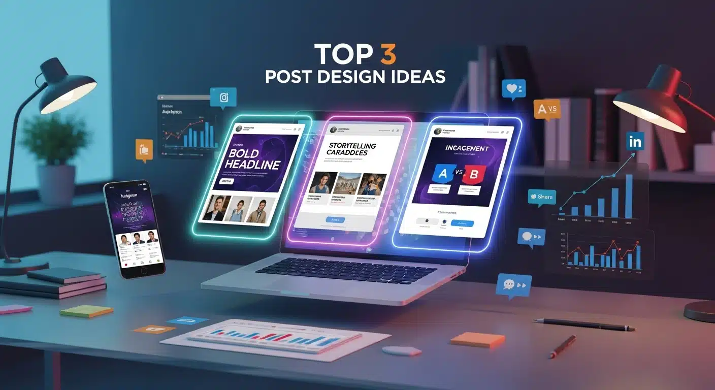
To make a social media poster that boosts engagement, focus on one clear message, strong visual hierarchy, high color contrast, platform-specific sizing, and a visible call-to-action. Posters that guide the viewer’s eye and communicate value within 3 seconds consistently outperform decorative designs.
What Is a Social Media Poster and Why Does It Matter?
A social media poster is your digital billboard. It’s a visual message designed to communicate one clear idea quickly across platforms like Instagram, Facebook, LinkedIn, and TikTok.
Think of it as a highway sign someone sees while driving 70 mph. But in social media, people scroll even faster.
With 5.24 billion users on social networks in 2025, competition is fierce. Your poster competes with friends’ photos, breaking news, and endless entertainment.
The best social media posters do specific things:
• Build brand awareness • Promote products or services
• Share valuable information • Drive website traffic • Strengthen community connections
But here’s what most people miss: every poster needs one clear action.
At AstraNova Labs, Elowen’s early posters were beautiful digital art. But they were not marketing tools. When she added simple buttons like “Learn More” or “Get Started,” her conversion rates doubled overnight.
A winning social media poster has four parts:
- Visual hierarchy that guides the eye
- Platform-specific optimization
- Consistent branding
- Clear calls-to-action
The Psychology Behind Posters That Stop the Scroll
Some posters go viral. Others flop. The difference is understanding how our brains work.
When someone opens Instagram or Facebook, their brain enters scan mode. They hunt for something interesting enough to pause their endless scroll. Users spend 141 minutes daily on social media in 2025, creating both opportunity and competition.
I learned this while working on a fitness campaign. Two nearly identical posters performed completely differently. The winner used bold color contrast and placed key text at eye level. The loser buried the message in pretty graphics.
Color Psychology That Works
Colors trigger emotions:
• Red creates urgency (perfect for sales)
• Blue builds trust (great for B2B)
• Green suggests health (ideal for wellness)
But the secret is using colors strategically, not randomly.
Typography That Influences Perception
Font choices matter: • Bold sans-serif fonts feel modern • Serif fonts suggest authority • Script fonts show creativity
Match your font to your brand personality.
Elowen tested this at AstraNova Labs. She created two identical posters, one flat and monochrome, another with bold red buttons on contrasting backgrounds. The high-contrast version got 3x more clicks because it triggered pattern recognition in our brains.
What Makes People Engage
We’re naturally drawn to: • Faces looking at us • Social proof like “Join 50,000+ users” • Scarcity signals like “Limited time”
The best posters combine multiple triggers without feeling pushy.
Platform Rules That Actually Matter
Every platform has its own personality. Ignoring this is like wearing a tuxedo to the beach, wrong for the situation.
Platform | Best Size | Key Features | What Works |
1080x1080px | Visual-first, mobile | Bold colors, minimal text | |
1200x628px | Community focus | Storytelling visuals | |
1200x1200px | Professional tone | Industry insights | |
TikTok | 1080x1920px | Mobile vertical | Large, readable text |
Instagram: The Visual Playground
Instagram users expect bold, eye-catching visuals that look great on phones. The platform favors square (1080x1080px) and vertical formats (1080x1350px) that take up maximum screen space.
Recent data shows travel influencers average 1.22% engagement while beauty influencers hit 1.26%. Instagram users scroll fast but engage deeply when something catches their attention.
Facebook: The Community Hub
Facebook works best with horizontal formats (1200x628px) or squares (1200x1200px). However, Facebook shares dropped from 15 per post in 2023 to 13 in 2024. The platform’s algorithm no longer prioritizes shareability as much.
Users spend more time reading and engaging with content here. They’re more likely to share posts that spark conversations.
LinkedIn: The Professional Network
LinkedIn demands a sophisticated approach. The platform’s median engagement rate rose from 6.00% in January 2024 to 8.01% in January 2025, the highest of any platform at 6.50% average.
Users look for insights, trends, and professional development. Your posters should position your brand as a thought leader.
TikTok and Stories: The Vertical World
Vertical formats (1080x1920px) dominate TikTok and Instagram Stories. Design for mobile-first with large, bold text readable on small screens.
When Elowen adapted AstraNova’s LinkedIn posters to Instagram, saves doubled because she made text larger and contrast stronger.
5 Must-Have Design Elements
Every high-performing poster contains five critical parts. Miss any, and your engagement suffers.
1. Typography That Guides Eyes
Typography creates a clear information hierarchy. Your headline should be the largest text, immediately communicating your main value.
Font pairing can make or break your poster’s professional look. Combine a bold headline font with a clean body text font. Never use more than two different fonts, it creates visual chaos.
2. Colors That Drive Action
Color choices should match your brand identity and campaign goals. Warm colors (reds, oranges, yellows) create energy, perfect for sales. Cool colors (blues, greens, purples) build trust, ideal for education.
Contrast ratios matter more than color preferences. Your text must stand out clearly from your background.
3. Visual Flow That Makes Sense
The human eye follows predictable patterns. The F-pattern (left to right, then down) dominates Western cultures.
Use the rule of thirds to place important elements at visual intersection points. White space gives your design room to breathe.
4. Images That Support Your Message
Choose photos that align with your brand and resonate with your audience. Authentic images often beat obviously staged stock photos because they feel more trustworthy.
Simple graphics work better than complex ones because they’re easier to understand at small sizes.
5. Calls-to-Action That Get Clicks
Your call-to-action should be the most visible element after your headline. Use contrasting colors that make it impossible to miss. Size it right for mobile taps.
Action language should be specific: “Get Your Free Guide” beats “Learn More.”
AstraNova’s early posters were beautiful but overcrowded. After Elowen applied proper spacing and text hierarchy, comments and shares increased 70% because viewers could understand the message quickly.
Tools for Every Skill Level
Tool | Best For | Price | Key Features |
Beginners | $12.99/month | Templates, brand kits, resize | |
Intermediate | $9.99/month | More customization, stock access | |
Teams | Free-$12/month | Real-time collaboration | |
Professionals | $52.99/month | Unlimited creative control |
Beginner-Friendly Options
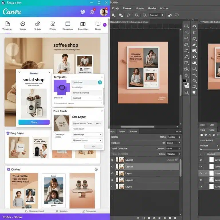
Canva Pro remains the top choice for non-designers who need professional results fast. The template library covers every use case. Brand kits ensure consistency. The $12.99 monthly cost pays for itself in time savings.
Adobe Express bridges beginner tools and professional software. Template quality rivals Canva with more customization. Adobe Stock integration provides premium imagery.
Professional Software
Adobe Creative Suite offers unlimited creative potential. Photoshop handles photo work. Illustrator creates scalable graphics. The $52.99 monthly subscription requires commitment but delivers professional results.
Figma revolutionizes team design through real-time collaboration. Component libraries ensure brand consistency across organizations.
How to Track What Works
Measuring the right metrics helps you understand what works and improve future designs.
Key Numbers to Watch
Engagement Rate measures likes, comments, and shares compared to followers. LinkedIn leads with 6.50% average engagement. Other platforms vary by industry.
Click-Through Rate tracks how many people click your links. This directly measures your poster’s ability to drive traffic. Good rates range from 1-5%.
Conversion Rate shows how many visitors complete actions like purchases or signups. This connects design directly to business results.
Platform-Specific Metrics
Instagram: Story completion rates, save rates, profile visits
LinkedIn: Professional engagement, lead generation, connection requests
Facebook: Link clicks, event responses, community engagement
Optimization Based on Data
A/B testing different elements reveals what works for your audience. Test headlines, colors, images, and buttons separately.
Elowen discovered AstraNova’s carousel posts outperformed single images by 2.7x, leading to a strategic shift in their content approach.
Case Study: AstraNova's Transformation
Elowen Hart’s journey at AstraNova Labs shows these strategies work in the real world.
Before: Sleek, polished posters with embarrassingly low engagement Problem: Beautiful designs felt cold and forgettable
Solution: Applied the 11 hacks systematically
Results: 4x engagement increase in 30 days
What Changed: • Added clear call-to-action buttons → conversions doubled overnight • Used high-contrast colors → 3x more clicks • Integrated testimonial snippets → 38% conversion increase
• Made text larger for mobile → saves doubled on Instagram • Switched to carousel format → 2.7x better performance
Key Insight: Perfect design without clear purpose loses to good design with strong strategy every time.
Action Steps to Start Today
Creating effective social media posters requires strategy, not just creativity. With 5.24 billion users competing for attention, every post must work hard to succeed.
Start Here:
- Audit your last 10 posts using engagement benchmarks
- Pick design tools that match your skill level
- Create a simple brand guide with colors and fonts
- Make your first optimized poster using this process
- Set up analytics to track performance
Remember: users spend 141 minutes daily on social media. Your opportunity is huge, but so is your competition. Make every poster count by applying these proven strategies consistently.
The social media landscape keeps changing, but good visual communication principles stay the same. Focus on serving your audience, communicate value clearly, and guide people toward action.
Master these basics, and your posters will succeed no matter what platforms or trends come next.
Quick Answer FAQs
Basic posters using templates: 15-30 minutes. Custom designs: 2-4 hours. Planning should take 30% of total time.
Instagram: 1080x1080px. Facebook: 1200x628px. LinkedIn: 1200x1200px. TikTok: 1080x1920px. Always design at correct dimensions.
Yes. Canva, Adobe Express free tier, and GIMP create professional results when used with proper design principles.
SEO algorithms change daily, with major impactful updates occurring a few times each year.
Trending topics, strong emotions, high contrast, shareable format, and perfect timing. Focus on consistent engagement over viral hits.