Ever walked past a display rack and grabbed one brochure while ignoring the rest? That’s the power of great design. Print and direct mail marketing bring a 9% customer response rate compared to other digital marketing channels, which hover around 1% or less, and according to recent studies, 82% of respondents ranked print as their most trusted medium when making purchasing decisions.
The latest 2025 research reveals 72% of consumers state that they prefer to receive direct mail and print marketing over digital communications, and 79% of consumers say they find it easier to read content in print. Yet most small businesses create brochures that end up in trash cans within seconds.
I’m Amin Ahmed, and I’ve designed over 800 print materials across four countries. Today, I’ll walk you through the exact 10 step process that transformed my clients’ marketing results. Ready to create brochures that people actually keep and act on?
Read More: brochure printing
Understanding What Makes Tri-Fold Brochures Work
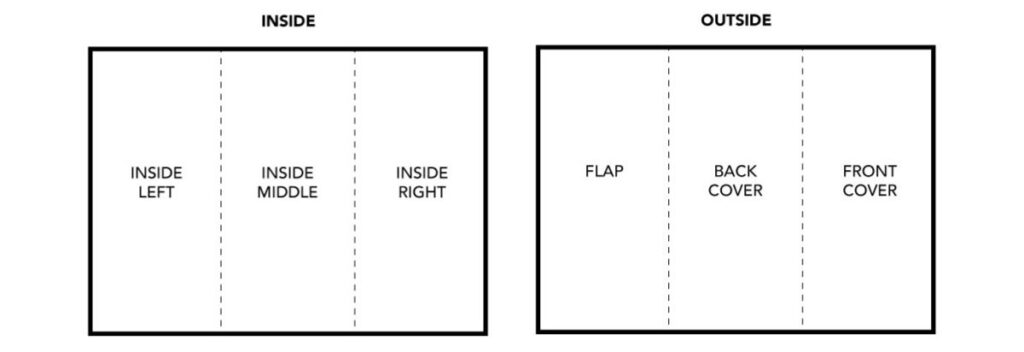
A three fold brochure uses one sheet of paper folded twice, creating six panels (three front, three back). It’s the most cost-effective print marketing format for businesses.
The Science Behind the Folds
The Anatomy Breakdown:
Panel Position | Purpose | Content Focus |
Front Cover | Hook attention | Headline + hero image |
Inside Flap | Build interest | Problem + solution preview |
Center Spread | Main content | Features, benefits, proof |
Right Panel | Support info | Testimonials, details |
Back Panel | Action step | Contact + call-to-action |
Why This Format Dominates:
- Cost efficiency: Single sheet printing saves 60% vs multi-page formats
- Perfect size: Fits in #10 envelopes and jacket pockets
- Proven flow: Six panels create a natural reading progression
- High recall: Print materials have a 70-80% higher recall rate than digital advertising, according to 2025 market research
Planning Your Content Strategy
Last year, I helped Zara Digital Marketing in Dhaka fix their failing brochure. Their original version was beautiful but generated zero leads. The problem? No planning.
Case Study: The 340% Lead Increase
Before: Generic messaging, stock photos, buried contact info
After: Targeted pain points, custom visuals, clear action steps
Result: 47 qualified leads in month one, $23,000 in new contracts
Read More: flyers and brochur
Your Pre-Design Checklist
Goal Setting (Choose One Primary Focus):
- Lead generation (phone calls, form fills)
- Brand awareness (recognition, recall)
- Product education (features, benefits)
- Event promotion (registration, attendance)
Audience Research Questions:
- What keeps your customers awake at 3 AM?
- Where do they currently get information?
- What language do they use (formal vs casual)?
- What proof do they need to trust you?
Content Mapping Framework:
Panel 1: Attention-grabbing headline (8 words max)
Panel 2: “You’re not alone” messaging + solution preview
Panel 3: Primary benefit with proof point
Panel 4: Secondary benefits + social proof
Panel 5: Objection handling + guarantee
Panel 6: Clear next step + contact details
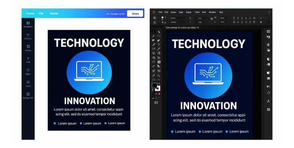
Choosing Your Design Software
After testing every major platform over seven years, here’s my honest comparison:
Software Comparison Table
Tool | Learning Time | Cost | Best For | Limitation |
Canva Pro | 2-3 hours | $15/month | Beginners, quick designs | Limited print specs |
Adobe InDesign | 40+ hours | $21/month | Professional layouts | Steep learning curve |
Microsoft Publisher | 1 week | $7/month | Office users | Basic features |
Google Docs | 30 minutes | Free | Ultra-budget projects | Very limited design |
My Recommendation Logic:
- First-time users: Start with Canva Pro
- Regular creators: Invest in Adobe Creative Suite
- Budget-conscious: Use Publisher with custom templates
- Emergencies: Google Docs table method
Setting Up Your Document Correctly
90% of printing problems come from a wrong setup. Here’s my bulletproof checklist:
Technical Specifications That Actually Matter
Document Settings:
Size: 8.5″ x 11″ (landscape)
Margins: 0.25″ all sides
Columns: 3 equal sections
Bleed: 0.125″ (for full-color backgrounds)
Resolution: 300 DPI minimum
Color Mode: CMYK for print, RGB for web
Panel Measurements (Critical for Clean Folding):
- Left panel: 3.625″ (slightly smaller for tucking)
- Center panel: 3.667″
- Right panel: 3.708″
Fold Line Guides:
- First fold: 3.625″ from left edge
- Second fold: 7.292″ from left edge
Common Setup Mistakes That Cost Money
The $2,400 Reprinting Lesson: I once set up 5,000 brochures with RGB colors instead of CMYK. The client’s brand is blue printed purple. Always use CMYK for print projects.
Text Safety Zones: Keep all important text 0.125″ away from fold lines and trim edges.
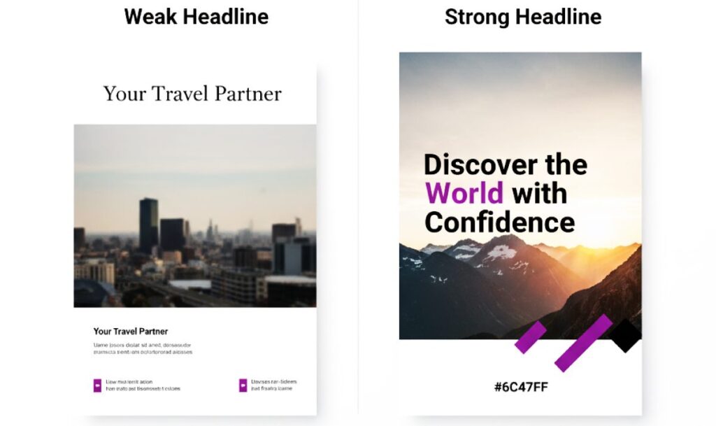
Designing Your Front Cover (The 3-Second Test)
Your cover has three seconds to stop someone walking past. Here’s what works:
The Psychology of First Impressions
Essential Elements Hierarchy:
- Benefit-driven headline (largest text)
- Supporting subheadline (explains the benefit)
- Hero image (shows the outcome)
- Company logo (builds credibility)
Real Example Transformation:
Before: “Sunshine Catering – Quality Food Services”
After: “Turn Your Event Into a Memory Your Guests Can’t Stop Talking About”
Result: 156% increase in inquiries for my Sylhet client.
Color Psychology That Converts
Industry | Primary Color | Psychology | Response Rate |
Healthcare | Blue | Trust, calm | +23% |
Finance | Navy + Gold | Stability, premium | +31% |
Food/Restaurant | Red + Orange | Appetite, energy | +44% |
Technology | Blue + Gray | Innovation, reliability | +18% |
Creating Inside Panels That Tell Your Story
Think of your inside panels as a conversation, not a catalog.
The Three-Panel Narrative Structure
Panel 2 (Inside Flap) – The Connection: Start with empathy: “Running a restaurant is harder than ever…” Then bridge: “That’s why we created a catering solution that…”
Panel 3 (Center) – The Evidence:
- List 3-5 key benefits (not features)
- Add one strong testimonial
- Include a credibility indicator
Panel 4 (Right) – The Proof:
- Show before/after results
- Add industry recognition
- Include a secondary call-to-action
Content Writing Formula That Works
Benefit > Feature Translation:
- Feature: “24/7 customer support”
- Benefit: “Get help the moment you need it, even at midnight”
Social Proof Integration: Instead of: “We have happy customers.” Use: “127 five-star reviews this month alone.”

Advanced Pro Tips from 800+ Projects
What Separates Good from Great
Fold Alignment Mastery:
- Test fold direction with paper grain
- Score heavy papers before folding
- Keep critical elements 0.125″ from folds
Color Matching Secrets:
- Order color proofs for brand-critical projects
- Use Pantone spot colors for logos
- Calibrate your monitor annually
Typography Excellence:
- Minimum 11pt for body text
- Maximum 3 fonts per design
- Test readability in poor lighting
Avoiding Expensive Mistakes
The $3,200 Learning Experience: Early in my career, I designed a gorgeous brochure with 9pt text. The client loved the design. Their 55+ target audience couldn’t read it. Always consider your audience’s needs over design trends.

Frequently Asked Questions
Standard 8.5" × 11" paper works for most needs. Legal size (8.5" × 14") gives more space. Tabloid (11" × 17") creates premium impact but costs more.
Expect $0.15-$1.50 per piece depending on quantity, paper quality, and finishes. Digital printing suits small runs (under 500). Offset printing saves money on larger quantities.
Letter fold (C-fold) panels fold inward sequentially, creating a compact package. Z-fold alternates directions like an accordion, showing all panels when partially opened.
Yes, using template-based tools like Canva Pro. Focus on clear messaging, high-quality images, and consistent branding. Professional designers add strategic thinking and technical expertise.
300 DPI minimum at final print size. Web images (72 DPI) will appear pixelated. Use vector graphics for logos and icons when possible.